

Mobile Checkout: Why Most Stores Lose Sales Here
Common mistakes that drive customers away at the final step — and exactly how to fix them.
Read ArticleThe layout, images, and copy that actually convert browsers into buyers. We’ve tested what works.

Most online stores treat product pages like an afterthought. They slap on a title, throw in some images, add a price, and hope customers buy. That’s backwards.
Your product page is where the actual sale happens. It’s not the homepage. It’s not the category page. It’s here — where someone’s already interested enough to click. They’re ready to learn if this thing solves their problem. And if your page doesn’t convince them, they’ll leave.
We’ve tracked what works across dozens of e-commerce stores in Malaysia and beyond. The difference between a product page that converts 2% of visitors and one that converts 5%? It’s not magic. It’s structure.

Every high-converting product page follows the same basic structure. Think of it like a story — you’re building trust with each section.
Your first image loads before anything else scrolls. This is your handshake. Make it count. We’re talking high-quality product shot on a clean background, ideally showing the product in context. Not just a flat lay. Show someone using it or the product in a real environment.
Title, price, rating, and the key features. Keep this section tight. Visitors should understand what you’re selling in under 10 seconds. Bullet points work better than paragraphs here. You’re answering: “What is this? Why should I care? What makes it special?”
Now you go deeper. Materials, dimensions, how it’s made, what problems it solves. This is where you build confidence. Use short paragraphs. Include comparison images showing the product at different angles. Don’t overwhelm — but don’t skimp either.
Real customer feedback is the most powerful converter. Three to five solid reviews beat a thousand five-star generic ratings. Include photos from actual customers if you can. This section should appear before the final call-to-action — it’s the last nudge before they decide.
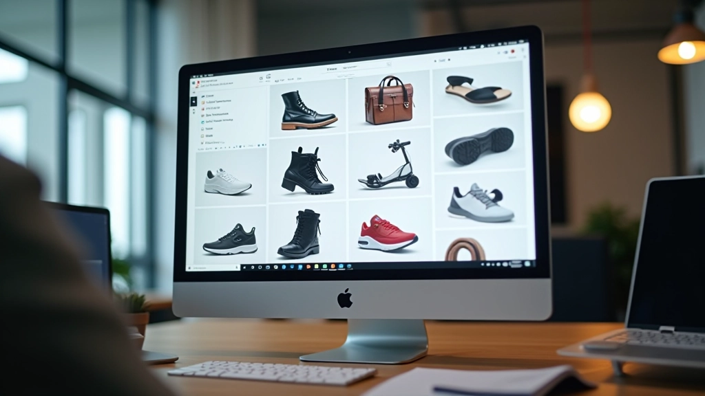
Here’s what we see most stores get wrong: they load 12 images, but three are blurry, two are duplicate angles, and one is obviously from a different product.
You don’t need dozens. You need five to eight excellent images that show different aspects. Think about it from a customer’s perspective. They want to see:
That’s five images. You’ve covered everything. Add lifestyle shots if you’ve got them. Skip the redundant angles.

Your headline matters. Not the product name — the headline. “Premium Leather Backpack” is boring. “The Backpack That Doesn’t Feel Like You’re Carrying a Brick” is specific and solves a problem.
Write the description like you’re explaining to a friend why you love this product. Use short sentences. Include specific details — not just “durable” but “tested to 200kg weight limit” or “survived three years of daily use in our office.”
Here’s the framework that works:
That’s it. You’re not writing poetry. You’re writing clarity. And clarity converts.
Your add-to-cart button should be visible without scrolling on mobile. It should be obvious. Contrasting color, clear text, generous padding.
Conversion rates improve by an average of 3-4% when product pages follow this structure consistently. That’s not huge individually. But if you’re running 100 products, that’s 3-4 extra sales per product per month. For most stores, that’s real revenue.
The biggest win we’ve seen? Moving customer reviews higher on the page. Most stores bury them at the bottom. But when reviews appear in the middle — right after the main description — conversion jumps noticeably. Customers need that confidence before they’re ready to buy.
Second win: better image quality and variety. This one’s obvious but worth stating. High-res lifestyle images outperform generic product shots by about 2-3% in conversion. Show your product in real situations. Show it being used.

Your product page doesn’t need to be fancy. It needs to be clear, trustworthy, and easy to navigate. Use this structure as your foundation. Get the basics right first — good images, clear copy, obvious call-to-action. Once that’s working, then you test variations and optimize.
The stores we work with that see the best results aren’t the ones trying to reinvent the wheel. They’re the ones that understand that conversion is about removing friction and building trust. Structure does both.
Apply this framework to your product pages. Test it. Measure the results. And watch your conversion rate climb.
Disclaimer: This guide is informational and based on common e-commerce design practices. Results vary depending on your specific product, audience, and market conditions. We recommend testing these recommendations with your own customer base to see what works best for your store. Conversion rates depend on many factors including product quality, pricing, shipping policies, and customer service — not just page design.